Typography That Converts: Choosing Type for Product Interfaces
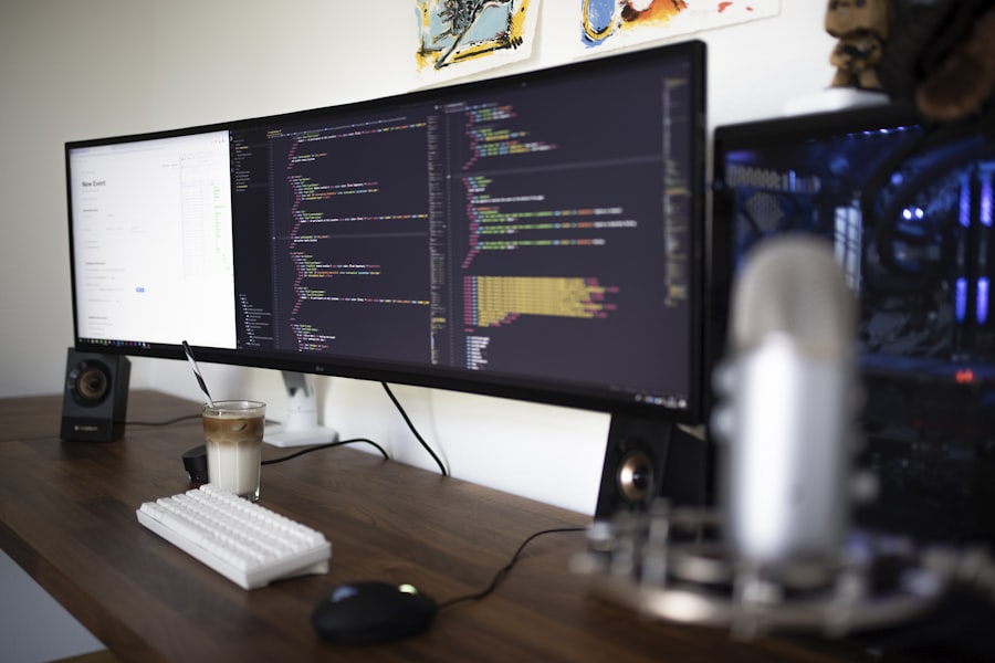 Design
The typeface you choose does more than set a tone - it directly affects readability, trust, and conversion rates in your product.
Type is the most underestimated design variable in product interfaces. Most teams spend weeks debating button colours and minutes choosing a typeface. The research suggests they have those priorities backwards.
Legibility vs Readability
Legibility is how easily individual characters are distinguished. Readability is how easily continuous text can be read. They're related but not the same - a highly legible typeface can still be unreadable at small sizes or long line lengths.
- Use 16px as your minimum body size - never smaller in product UI
- Keep line length between 60–80 characters for comfortable reading
- Use a line height of 1.5–1.6 for body text
System Fonts vs Custom Fonts
System fonts load instantly and look native on each platform. Custom fonts add personality and brand distinctiveness but cost performance. The right answer depends on how differentiated your brand needs to feel vs how fast your pages need to load.
Recent Blogs
View all






The #1 Service Solution
Ready to Transform Your Customer Relationships?
Book a personalised demo with our CRM experts. We'll show you how iZape can be configured for your specific industry, team size, and growth goals - in just 30 minutes.
What to expect:
- Live walkthrough tailored to your use case
- Answers to all your questions from a CRM expert
- Custom pricing based on your team size
- Free 14-day trial after the call
Trusted by 2,500+ Businesses Across India
Request a Free Demo
Fill in your details and we'll be in touch within 24 hours.
By submitting, you agree to our Privacy Policy . No spam, ever.